This is a visualization for data produced by pangraph, which you can read more about in these two papers from Nicholas Noll, Marco Molari, Liam Shaw, and Richard Neher. A pangraph is a way to look at a population of closely related genomes, and this browser is an attempt to make that looking easier. In brief, a pangraph represents each genome as some path through a series of blocks of DNA, and each block represents a multiple sequence alignment of very closely related sequences. Some of these blocks appear only once and appear in every genome - these are called "core" blocks. Other blocks are either not present in every genome or present in every genome but repeated in multiple locations.
This visualization was made by Milo Johnson (milo.s.johnson.13@gmail.com) as part of a group project at the Kavli Institute for Theoretical Physics with help from Marco Molari, Richard Neher, Indra Gonzalez Ojeda, Caelan Brooks, Sofya Garushyants, Isaac Gifford, Athina Diakogianni, and James Ferrare. It is on github here.
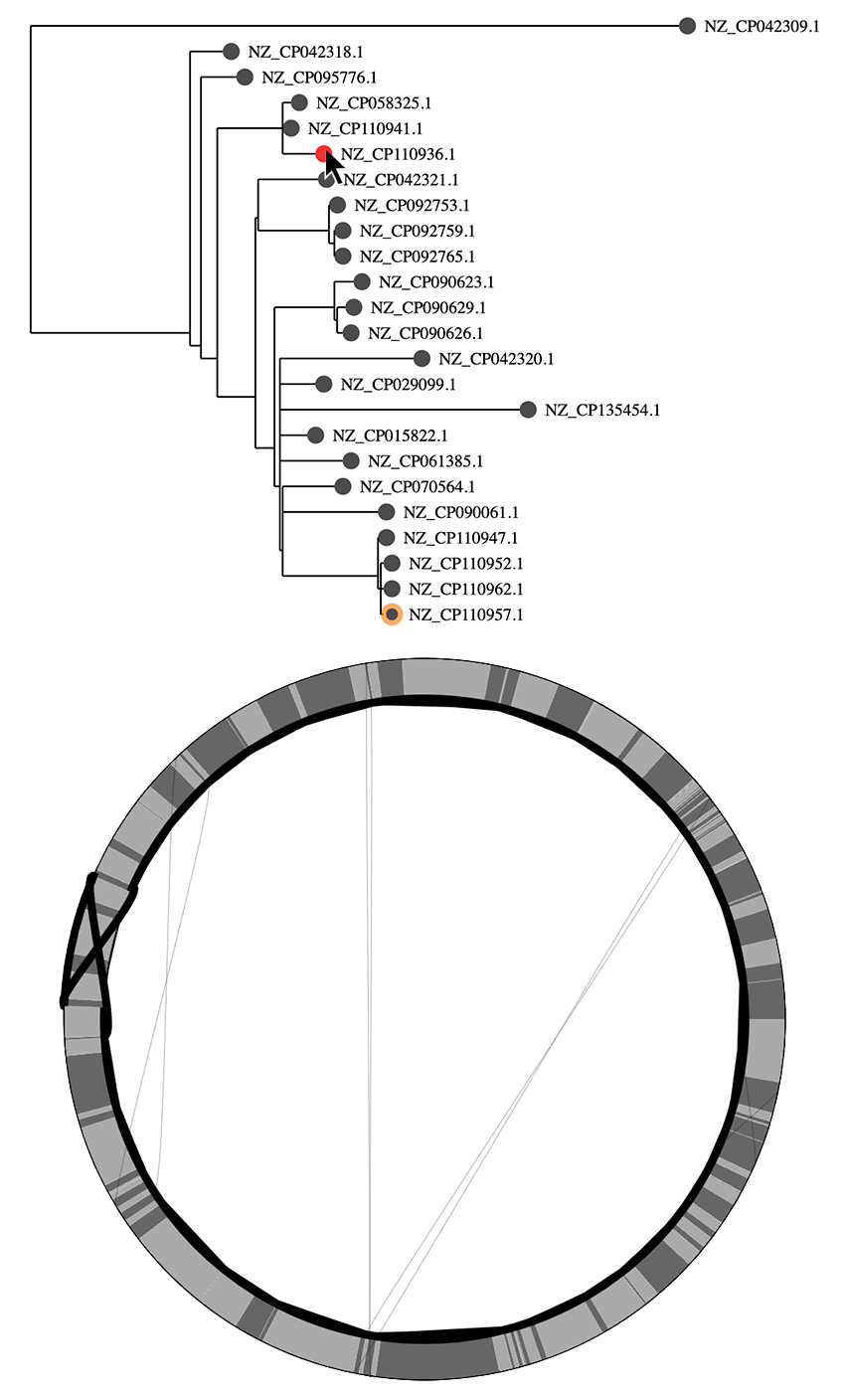
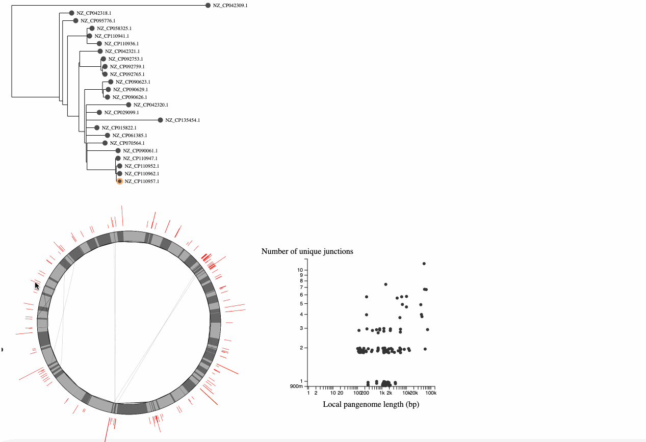
At the top left of the visualization is a "core genome tree" drawn from a newick file (if you don't have a tree, you will just see a mock tree with every genome on its own branch). This tree is an attempt to show the clonal lineages of the genomes, and should be built from an alignment of putatively recombination free sequences (see the papers for more details, this is tricky!).
At the bottom left is a representation of the pangraph. In this representation, we are only showing core genome blocks in alternating grays (note that some are too small to see). We are showing these core blocks in the order of the reference genome (the node on the tree that has an orange ring around it, you can click on a node to switch to a different reference). The lines on the graph represent the path associated with each genome. Lines that follow a perfect circle have the exact same pattern of core-block synteny as the reference. Lines that deviate from the circle represent structural rearrangments. You can hover over nodes to see the associated paths - in this example we can see that there is an inversion in this genome.
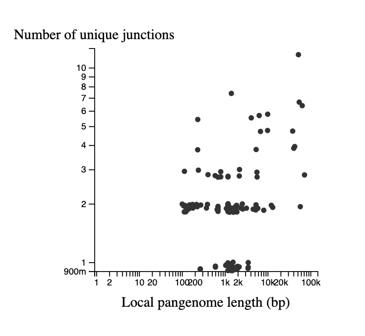
In the bottom left is a graph describing the statistics of the junctions between core genome blocks. This is a version of the graphs in Figure 3 of Molari et al. 2024. Each point represents the junction between two core blocks (again for the synteny order in the reference genome). The x-axis shows the "local pangenome length" of the junction, which is the total length of all unique blocks that appear between these two core blocks, across all genomes. The y-axis shows the number of unique paths between the two blocks in the set of genomes. Points are jittered on the y-axis to make them easier to see. It is possible to have only 1 unique path when the path is the same in all genomes, but the blocks in the junction are repeated elsewhere in the genome (generally representing repetitive elements). Each point on this graph is also represented in the pangraph to the left, by a red arc at its location in the graph, and the arc height and width represent the # of unique paths and the local pangenome length, respectively.
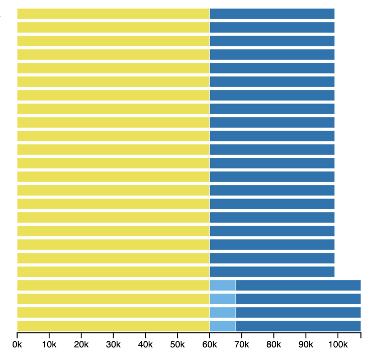
When you hover or click on one of the points or arcs representing a junction, you will see the junction represented to the right of the tree. This shows the core blocks to the left and right and any intermediate blocks between them, lined up with the appropriate nodes of the tree. In this example, we can see that a block is inserted in the four genomes at the bottom of the tree, which form their own clade.
The gif below shows some example usage of the tool. A few things to note: